Crazy for Color
Many of the comments I received last week in response to my design epiphany posts talked about color, and somewhat fittingly before I managed to type out those posts, I wrote down several paragraphs about color and my (crazy) feelings about it. I've decided to share in case it's helpful to you, but I'm hoping I don't come across as too obsessed.
I've known for a while now that the colors I pick for a kit will make or break the final result. There have been several occasions when I've designed myself into a corner based on poor color choice at the beginning. From these experiences I've learned that it's better to have a loose idea of color choice at the beginning. You can't really have a good idea about a palette until you've actually worked with it. For this reason I now expect to remake my papers a couple times. Sometimes it's just a matter of redoing a few, although it does sometimes require a complete revision. For my Lake District Bundle, I tried 3 very different color palettes before I finally figured out what exactly I was going for. Don't be afraid to scrap something if it's not feeling right. It will just get more and more difficult if you aren't completely sold on the colors you're using.
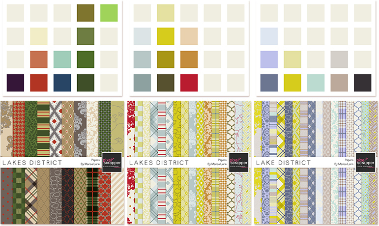
Third times the charm!
When it comes to actually choosing a palette, I rarely settle for one that's been pre-made. There are lots of great palette options out there, but most of them are limited to four or five colors, which is rarely enough for me. Sometimes it's a simple as adding lighter shades to a pre-made palette I love. But more often than not, I pick several palettes that have similar colors and then mix and match until I have something I love.
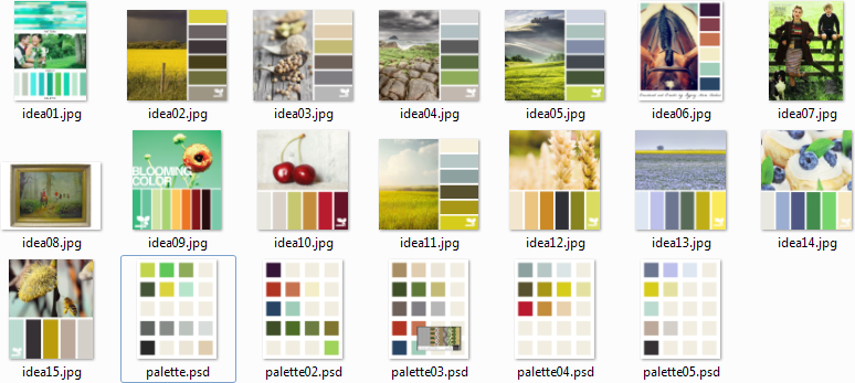
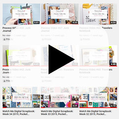
A look inside my color planning folder.
Also, an interesting fact I've learned is that I don't like to design with colors that I love in real life. As in, the colors I love to wear and surround myself with are not the colors I like to design with. This could be related to the fact that in real life if it's not neon or found in a Lisa Frank sticker, I don't want to see it. But those super bright colors just aren't as versatile, and let's be honest, they're pretty overwhelming. So I've learned that I always need to tone down the colors I pick. I also love to design with some colors that I hate in real life (brown and navy I'm looking at you). Some colors I really can't handle anywhere except with extreme caution (purple and green). And I know I said earlier that I like to work with muted colors, but that's only muted in relation to neon. If I mute things too much I will be so miserable that I have to toss the whole project (this Footsteps Bundle just barely made it out of my folder. I still can hardly bear to look at it).
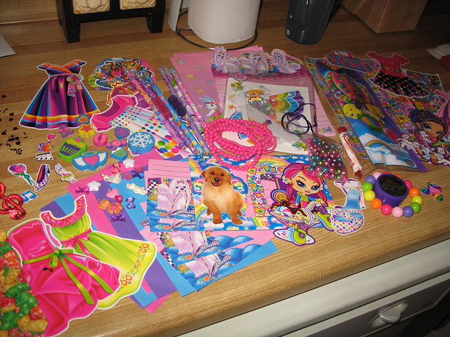
I can't heart this photo enough. Photo by Manitoba Coupon Maven.
Now that I've just typed out that last paragraph, I feel perhaps like I react a bit strongly to color. The more I work with it, the more I find that my reactions to it strengthen and in some cases become unreasonable (I have certain feelings about the color blue in real life. You don't want to be around if I see my nemesis shade. I feel a bit like I'm living in "The Yellow Wallpaper.") So a friendly warning, too much thinking about color may make you a little crazy.
Blog By

Subscribe to this blog
![]()
![]()
My Projects


Follow Marisa Lerin
Monthly archive
- November 2012 (9)
- December 2012 (37)
- January 2013 (17)
- February 2013 (13)
- March 2013 (20)
- April 2013 (26)
- May 2013 (29)
- June 2013 (9)
- July 2013 (8)
- August 2013 (13)
- September 2013 (16)
- October 2013 (14)
- November 2013 (16)
- December 2013 (12)
- January 2014 (15)
- February 2014 (9)
- March 2014 (15)
- April 2014 (11)
- May 2014 (4)
- June 2014 (9)
- July 2014 (8)
- August 2014 (7)
- September 2014 (8)
- October 2014 (13)
- November 2014 (6)
- December 2014 (3)
- January 2015 (13)
- February 2015 (14)
- March 2015 (14)
- April 2015 (13)
- May 2015 (12)
- June 2015 (11)
- July 2015 (10)
- August 2015 (8)
- September 2015 (7)
- October 2015 (10)
- November 2015 (8)
- December 2015 (10)
- January 2016 (7)
- February 2016 (6)
- March 2016 (8)
- April 2016 (7)
- May 2016 (8)
- June 2016 (8)
- July 2016 (6)
- August 2016 (5)
- September 2016 (8)
- October 2016 (8)
- November 2016 (11)
- December 2016 (7)
- January 2017 (6)
- February 2017 (12)
- March 2017 (10)
- April 2017 (7)
- May 2017 (9)
- June 2017 (9)
- July 2017 (10)
- August 2017 (7)
- September 2017 (11)
- October 2017 (8)
- November 2017 (9)
- December 2017 (8)
- January 2018 (8)
- February 2018 (8)
- March 2018 (8)
- April 2018 (4)
- May 2018 (9)
- June 2018 (9)
- July 2018 (4)
- August 2018 (5)
- September 2018 (13)
- October 2018 (19)
- November 2018 (18)
- December 2018 (14)
- January 2019 (23)
- February 2019 (20)
- March 2019 (17)
- April 2019 (14)
- May 2019 (17)
- June 2019 (14)
- July 2019 (8)
- August 2019 (3)
- September 2019 (14)
- October 2019 (17)
- November 2019 (16)
- December 2019 (6)
- January 2020 (14)
- February 2020 (20)
- March 2020 (16)
- April 2020 (18)
- May 2020 (19)
- June 2020 (16)
- July 2020 (8)
- August 2020 (5)
- September 2020 (8)
- October 2020 (10)
- November 2020 (10)
- December 2020 (7)
- January 2021 (4)
- February 2021 (9)
- March 2021 (8)
- April 2021 (7)
- May 2021 (7)
- June 2021 (7)
- July 2021 (10)
- August 2021 (7)
- September 2021 (8)
- October 2021 (5)
- November 2021 (7)
- December 2021 (6)
- January 2022 (5)
- February 2022 (7)
- March 2022 (9)
- April 2022 (6)
- May 2022 (7)
- June 2022 (4)
- July 2022 (2)
- August 2022 (1)
- September 2022 (3)
- October 2022 (6)
- November 2022 (4)
- December 2022 (6)
- January 2023 (4)
- February 2023 (5)
- March 2023 (6)
- April 2023 (5)
- May 2023 (5)
- June 2023 (5)
- July 2023 (5)
- August 2023 (5)
- September 2023 (5)
- October 2023 (4)
- November 2023 (4)
- December 2023 (5)
- January 2024 (4)
- February 2024 (5)
- March 2024 (5)
- April 2024 (2)
Recent Comments
I sometimes find myself getting stuck on color choices, too. Every once in awhile I force my self to choose some really odd colors just to create a challenge, and sometimes I really get challenged! The Lakes Districts look like they could be seasonal. First one I think of winter, the second one reminds me of summer and the third cold be spring. How do you pick the design of the papers you will use, Whether it be plaid, floral, etc?
I know this sounds silly, but I went to school for graphic design and I still feel shaky on color sometimes. I get too bent out of shape I think on if it goes well enough together academically speaking versus does it just work! I feel that when I break the rules to color, it usually results in a fun and unique way :)
I feel so silly for admitting this, but as I read through your post, the first thing that really popped into my head wasn't related to designing but, "Oh my gosh, they still make Lisa Frank stuff!?"
Love the pale colors in the third set:) My color choices all all off the chart! I love pales, then will see something really bright and have to have it! I also like the colors in the Footsteps bundle, but probably more because those are colors I can live with in my home & never get tired of:) On the other hand, if my favorite color is green...Why are most of my clothes blue!! See?? Off the chart :p
It is so funny how different everyone is. The footsteps bundle is one of my absolute favorite of the kits you offer. I love using muted earth tones.
Interesting that you like to design with colors you don't like for your clothing or surroundings. I guess I'm like that to. I've always liked colorful things and I use to do a lot of sewing so I have a fabric stash larger than my scrapbooking stash; however, before I started designing I had an aversion to orange and purple, but now I have a new found appreciation for them and all colors I see.... I do the mix and match thing too when creating color palettes.
Color makes me happy and when I am shopping for kits I usually pick a kit that has a wide range of color. In looking through the kits I have I see that monochrome kits are just not my thing. I tend to lean toward lots of colors together. I have a hard time using a kit that is totally bright, too. I like a piece or two that is bright but not the whole kit. I guess I don't like to be overwhelmed. I know everyone has their own likes and dislikes but I also know what I like to work with. People are always asking me what my favorite color is and I have no answer for them. My favorites change from day to day and from mood to mood. But I love colors. I look out this morning and the sun shining on the green with a blue sky beeps my button. Love colors!
Yes, color is a toughie for me as well. I tend to lean toward bright and vivid all the time (bet you'd never guess it by looking at my designs. ;)) I'm so glad that we have the blog train freebies every month. They're forcing me out of my comfort zone. Goodness knows that there are plenty of people out there who aren't nuts about rainbow kits. Just so tough to break the habit (I say as I take a break from designing another vibrant kit). :/
I definitely agree about colors. I've found that I can like a palette and then when I start making papers or elements they just don't look at all how I thought they would. Thanks
Just wondering, Marisa, but do you pick colours from a photo or other image? Looking at your ideas, I noticed that some of them have a photo/colours on the same image. And where do you get the pre-made palettes you mentioned?
You are so right about colors and confusion with them. Sometimes it is the reason why I give up from the very begining to start a kit, because I simply can't find the right combination with the tones lol :D but it is very personal you know. For me, I cannot make kits with solely mute colors, there has to be one color to stand out, but contrary I usually in love with Sheila's kits that has all pastel colors yet so in harmony. And sometimes I see very bright kits in other stores and very surprised how they combined all stand out colors together. Yet I don't think that your kits had bad choice colors, mostly I love them and actually the second Lake District colors are as pretty as the third one :D
I love this post, it is all so true! Color is very important, it is one of the reasons I love to design, yet tricky to work with. I, like many here, go through several palettes before deciding on which colors to use. I try different ones here and there until I find what I like to work with, and then sometimes, ditch them for different ones right in the middle of a kit, and have to go back and redesign some elements. But in the end, when you are happy with the outcome, there is really nothing better than to look at the finished results and say to yourself "It is good", haha.
I just love you :) thanks for sharing - and I TOTALLY get it. Color is one of the most important things to me too, so if it's not working, that's probably why :) (I'm still bugged by a "wrong" color in one of my layouts... it's going to get changed when I have a minute. Which seems to be never, but at least before I print it!) :)
I am very similar to you when it comes to color to scrap/design. :) I hate orange, specially bright orange, in real life, but its soooooo cool in scrap materials... Bright greens only on digiscrap stuff for me too. And I have a creative block with all the shades of pink for designing, but love them for clothes and decoration. The only color I think goes right with everything is red/burgundy. On the color choosing process I do almost as you - but I separate two or three palettes that work well together and make different small coordinating kits...
Hahaha! I love your take on colors. And I love this little look inside your head (and ideas folder). Thanks for sharing your ramblings on color, I enjoyed it!
Such a great post. This really feels like a conversation with a friend. About the subject, that's why I like leaving the designing to you designers, one less thing for me to stress about...
I love this topic ... and isn't that blue I see in your photo????... lol .... sometimes when I am stuck colour is what the issue with rather than the patterns, elements not sitting with each other.