Layout Fix #2: Element Placement
I was going to talk a little more about Catherine's layout from last week, but she made such a nice redo herself, I thought we could let it rest.

As soon as I saw this layout from Tiffany I was intrigued. She is clearly a girl after my own heart following the desire to put as many elements on a page as is possible (or in this case perhaps a bit beyond possible :) ).
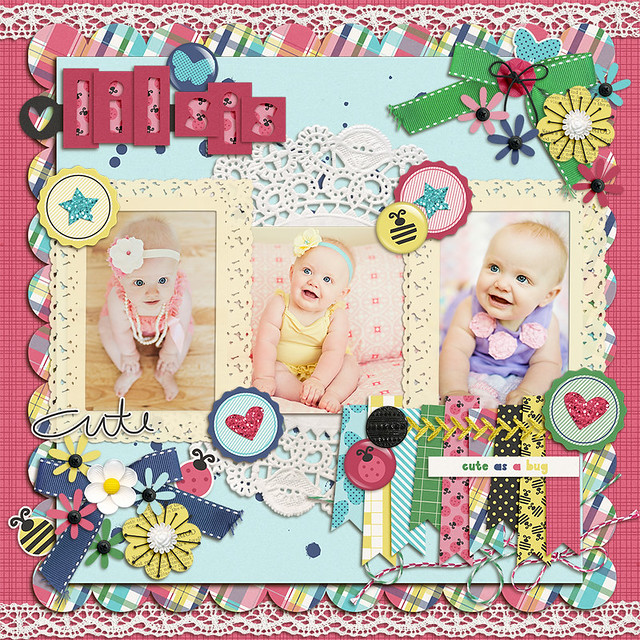
I feel like immediately upon looking at this, anyone would give the advice to take away lots of the elements, it's just too cluttered. But Tiffany is too smart for us, and already tried that.
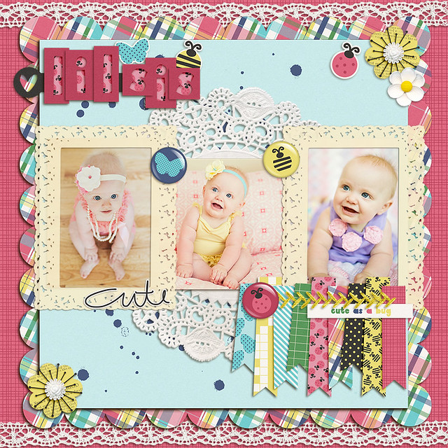
There is less clutter on the page, but it's still missing whatever magic that makes a layout feel finished. So I decided to challenge myself to figure out how to use ALL the elements on one layout.
It turns out the answer to this challenge is not difficult, in theory (execution of course, is a different thing). It's even a current scrapping trend, although it's such a basic design principle that I'm not sure it can be considered trendy. I'm talking about clustering.
Of course when you say clustering in the scrapbooking world, it brings up images of what I've done here. Layouts covered in intricately layered elements. This may not be your cup of tea, but the basic idea of clustering is what elevates a page of stuff to a designed layout. It's the art of grouping that's going to bring flow and interest to the page. Without it, it's just going to be a bunch of stuff.
I'm not sure that I've done justice to this idea in the layout, it still feels a bit cluttered, but I think even with my undeveloped clustering skills the importance of placement has been illustrated.
Making groups isn't the end of the story. In order to get that "finished magic" you need to look at what the groups are doing. In her original layout, Tiffany has several very nice clusters. However, they're placed around the page without a sense of flow. There's no clear place to start looking, and no way to know to stop looking. Did I see everything? I don't know. When placing things on the page you want to think about where you want people to look and how they'll get there.
And don't forget that breathing space (white space) is always important, even in a layout that's going for a cluttered, collage feel. The white space works with the clusters to guide your eye along.
What do you think? How did I do?
If you have a layout you'd like me to "fix" please email it to [email protected]. You'll likely need to zip the file and use a file sharing service (Google Drive, Dropbox, etc) to share such a large file. I will reply to your email to let you know I've received it. If you haven't heard from me after a day or two, try sending it again.
Blog By

Subscribe to this blog
![]()
![]()
My Projects


Follow Marisa Lerin
Monthly archive
- November 2012 (9)
- December 2012 (37)
- January 2013 (17)
- February 2013 (13)
- March 2013 (20)
- April 2013 (26)
- May 2013 (29)
- June 2013 (9)
- July 2013 (8)
- August 2013 (13)
- September 2013 (16)
- October 2013 (14)
- November 2013 (16)
- December 2013 (12)
- January 2014 (15)
- February 2014 (9)
- March 2014 (15)
- April 2014 (11)
- May 2014 (4)
- June 2014 (9)
- July 2014 (8)
- August 2014 (7)
- September 2014 (8)
- October 2014 (13)
- November 2014 (6)
- December 2014 (3)
- January 2015 (13)
- February 2015 (14)
- March 2015 (14)
- April 2015 (13)
- May 2015 (12)
- June 2015 (11)
- July 2015 (10)
- August 2015 (8)
- September 2015 (7)
- October 2015 (10)
- November 2015 (8)
- December 2015 (10)
- January 2016 (7)
- February 2016 (6)
- March 2016 (8)
- April 2016 (7)
- May 2016 (8)
- June 2016 (8)
- July 2016 (6)
- August 2016 (5)
- September 2016 (8)
- October 2016 (8)
- November 2016 (11)
- December 2016 (7)
- January 2017 (6)
- February 2017 (12)
- March 2017 (10)
- April 2017 (7)
- May 2017 (9)
- June 2017 (9)
- July 2017 (10)
- August 2017 (7)
- September 2017 (11)
- October 2017 (8)
- November 2017 (9)
- December 2017 (8)
- January 2018 (8)
- February 2018 (8)
- March 2018 (8)
- April 2018 (4)
- May 2018 (9)
- June 2018 (9)
- July 2018 (4)
- August 2018 (5)
- September 2018 (13)
- October 2018 (19)
- November 2018 (18)
- December 2018 (14)
- January 2019 (23)
- February 2019 (20)
- March 2019 (17)
- April 2019 (14)
- May 2019 (17)
- June 2019 (14)
- July 2019 (8)
- August 2019 (3)
- September 2019 (14)
- October 2019 (17)
- November 2019 (16)
- December 2019 (6)
- January 2020 (14)
- February 2020 (20)
- March 2020 (16)
- April 2020 (18)
- May 2020 (19)
- June 2020 (16)
- July 2020 (8)
- August 2020 (5)
- September 2020 (8)
- October 2020 (10)
- November 2020 (10)
- December 2020 (7)
- January 2021 (4)
- February 2021 (9)
- March 2021 (8)
- April 2021 (7)
- May 2021 (7)
- June 2021 (7)
- July 2021 (10)
- August 2021 (7)
- September 2021 (8)
- October 2021 (5)
- November 2021 (7)
- December 2021 (6)
- January 2022 (5)
- February 2022 (7)
- March 2022 (9)
- April 2022 (6)
- May 2022 (7)
- June 2022 (4)
- July 2022 (2)
- August 2022 (1)
- September 2022 (3)
- October 2022 (6)
- November 2022 (4)
- December 2022 (6)
- January 2023 (4)
- February 2023 (5)
- March 2023 (6)
- April 2023 (5)
- May 2023 (5)
- June 2023 (5)
- July 2023 (5)
- August 2023 (5)
- September 2023 (5)
- October 2023 (4)
- November 2023 (4)
- December 2023 (5)
- January 2024 (4)
- February 2024 (5)
- March 2024 (5)
- April 2024 (2)
Recent Comments
What a beautiful layouts!! ^_^
I think Catherine's re-do here is awesome! Although I liked the final layout in last week's re-do, I just wasnt sure with the pink/purple paper. It made the girls' skin dark pink/purplish, practically matching the paper's color itself. Now with a lighter background, I can now focus on the smiles instead of the background color.
On Tiffany's layout, I like the final re-do. It still has a lot of elements, yet it doesn't distract from the pictures.
I'm a big fan of featuring at least on picture on a layout and I must admit that I LOVE LOVE LOVE the baby's blue eyes. I think the photo on the right would be a great focal point on a layout by placing it in the middle.
I'd make it slightly larger and use the smaller pictures on either side of the larger one. I would keep the clustering like it is on the last re-do layout, except I would place it lower on the page and use it like a border. I like the original background layout that Tiffany did (minus the lace). I think I would switch the middle elements with the ribbon flags so that the flags are still under the main picture.
Well, at least the layout looks good in my mind's eye, lol!
Nice fix! Marisa's layout made it so dynamic that I was thinking about series...like this was just a detail of a bigger work. I was wondering where the rest of those cute pictures are ;-) I like the originals both, maybe the first one is a bit cluttered indeed. And I always like matching colors of the pictures together with papers and elements.
Great redo! I love how the photos pop now - although they are so amazing they could stand alone! I like the white space and clusters guiding the eyes along... I need to work on that. Thanks!
I like how you broke up the photos a bit. I did like several of her clusters and miss the lace at the top and bottom. I liked how you put the ladybug next to the flowers in your first attempt. I really like your fix. Very nice :)
l like that you kept the ribbon flags on the large picture - that is my favorite part and then I love the stitching on the edge of the picture instead of over the ribbon. Nice job!
Love that. :)
I love me some madras :)
My slow-logic brain had a hard time reading "lil sis" I had to go over each letter to make sure I had it and then put it together. Part of it is I have a hard time reading the alpha-elements. But I think maybe I had a hard time because the pink letters are so close to the pink background. Maybe instead, up near the doily?
I like them all. The one layout with "everything AND the kitchen sink" does kinda give me a bit of eye strain but it is so cute I forgive. I must admit the fixes are improvements but they are all adorable!!!
Hello, my name is Tiffany, and I am a stuff-o-holic. Great job using all the STUFF Marisa! I just thought it was too cute not to use it all! I definitely think the redo is much more dynamic. Non-symmetrical... good call.
First to comment...
I like the way you varied the sizing of the cut-out mats. I think it helps the eye continue in it's movement.
Thanks Tiffany for letting us use your layout. As I was looking at the photos - ADORABLE!!! - I also think I like how Marisa framed them. Like when she divided the plaid paper, she's using rule of thirds...you don't always want to place the focus point, those eyes! in the middle, either at 1/3 or 2/3rds can really help. One of the things I like about GIMP is it gives you an option to put guides on your photo when cropping.
Excited to see comments and more discussion. :)