So, you've probably seen those word art canvas prints that are so popular. I wanted to make a few for my own home, but no matter what I do, they seem to just look... messy. I've tried to find tips online on how to do this well, but mostly all I get are actual construction tips on making a canvas print, rather than design tips. Any thoughts on how to do this well?
Examples of what I'm talking about:
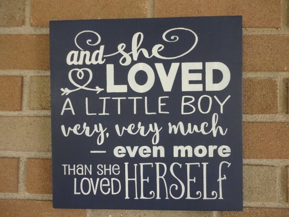

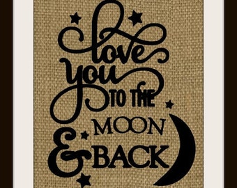
I personally like it when there are only a few different fonts. I think I count 8 fonts in the first one you posted. The other two examples have only 2 or 3 which I think is a better design principle, in my opinion. There would certainly be situations where more is better though, the first example isn't bad per se. Different sizes of the same font or fancy/regular versions of the same or similar fonts work well to emphasize certain words. Another design principle that I like is when the words are all justified on the edges. This is done well in the second example you posted. Of course that won't work for every situation but works great for a canvas.
Yes I am crazy about creating word art myself. I agree with @Hilary. Choose the right fonts. Pinterest has lots of font combination techniques you can find. Emphasize the words with higher meaning so they standout and use guides or rulers to get the spacing properly. Then have fun adding color, texture and other swirls to add the decorative touch. You can also warp your text in PS and get it to bend or change perspective too.
What we call word art, the rest of the design world calls typography. A quick Google search brought up these that seem useful to me...
https://designschool.canva.com/blog/combining-fonts-10-must-know-tips-from-a-designer/
https://designschool.canva.com/blog/perfect-font-palettes/
http://designshack.net/articles/graphics/8-rules-for-creating-effective-typography/
This is a fun site for seeing how to combine fonts and make them work, too--Aesop's Fables and Google Fonts pairings... https://femmebot.github.io/google-type/
Typographic layout is almost as much of an art as clustering, so don't feel bad that your first attempts feel messy--it's part of the learning process. Just try to figure out why it feels messy and how to improve it. Usually the first thing that you notice can be a big help--try swapping it for another font or moving it just the tiniest fraction.
You've got to spend some time actually playing with typography before you start understanding how all the rules work and interact. Try creating your first typography with a single font plus some basic lines, just varying size or color, then move on to one family (regular and bold or italic). Then move on to using more than one font (try some of the pairings from http://www.typegenius.com/!) and learn how that works. It sounds like a lot, but it'll help you get good at making word art quickly.
Thanks, ladies! I have to admit that my first thought was usually "fewer fonts" but then I'd see examples of ones that I like and say "well that uses more than 2 or 3..." But just because someone else can make it work doesn't mean I should try just yet! LOL
& Thanks @Holly for the correct terminology! That definitely helps if I know what to search for!
Thanks for the encouragement!
Personally, I found it helpful to actually buy some fonts, it took the design up a few levels. I've bought a few bundles from Design Cuts, which I think is a great way to get started with fonts because when they do a font bundle you'll get a good selection for mixing and matching, and they often include "trendy" fonts, which helps get the feeling of things you see on Pinterest.
The paid fonts generally are much more appealing. There's a couple places that offer a free font every week...
Try Creative Market (they do 6 freebies starting every Monday) or Little Big Crafter....
I'll second Design Cuts' font bundles, especially as they come with an extended license which means you can use them for flattened word art. DealJumbo also has a TON of freebies as well as good font bundles with extended licenses.
Thanks for the links to the really neat sites, even though I wasn't the one to ask the question!
I agree with Debra. Thank you for all the good websites to get fonts from.
@Holly, you always seem to know exactly what everyone else needs. I love it!
This is a skill I've wanted to work on too. I've been collecting examples on Pinterest for inspiration.
@Christi: I started doing typography in high school for our yearbook in the early 90s and have been making quote layouts for my desktop wallpaper since around 2000. I've never had to pay for wedding invitations or birth announcements, nor for resume design back when I was able to work. It's pretty easy to give a few pointers after 25 years of creating typography for myself.
Word art is one of the easiest things for me to create, once I dig through the huge collection of fonts I've downloaded over the years and choose a few complementary ones. I lean more toward fully-featured OpenType fonts now, with multiple language support, ligatures, and contextual alternates. TrueType are okay, but limit what you can do due to limited numbers of glyphs available. Now that I've learned how to use Illustrator, I sometimes modify the font outlines if an alternate character or ligature isn't available, just to either avoid letters awkwardly overlapping or to add an extra decorative swash to the end of a word. Don't discount the value of doodling around the words, either — a few lines can make a major impact!
I am addicted to both fonts and Canva, so I was really excited to stumble upon this thread! I've been working on a lot of word art/typography projects lately, mostly for my advertising campaigns and newsletter for my small business, but also for use in the new planners (instant digital download; PDF format) and (digital) scrapbook kits I'm presently making. I have a major "font habit"--the more unusual, flourished, and decorative the better--and I tend to get WAY over-busy when putting things together sometimes. The links here majorly helped, so thanks much!