
So I created a page that I'm not satisfied with and would like so help/advice on finishing it. This is what I came up with but can't seem to finish it. I still need to fix the paper clip, but I haven't decided if that's where I want to put it, so I haven't cropped it yet. Also, I'm not happy with the background paper (the red one in the way back). And I feel like the journalling area needs work. Suggestions/advice/help please!!!
[img]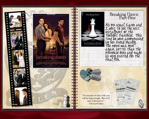 2011_breaking dawn 1 3000 by mbechtloff, on Flickr[/img]
EDIT: thank you to everyone who made suggestions ... I took a lot of your advice and this here is my revised version. I'm much happier with it and have all you to thank.
[img]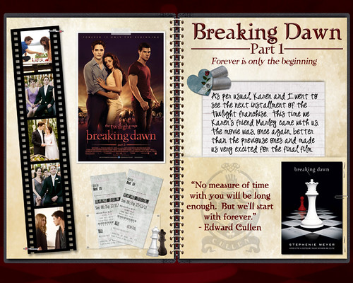 2011_breaking dawn part 1_600 by mbechtloff, on Flickr[/img]
Thanks again
Hi Melissa,
Great idea to ask the community for help! I have half a book that desperately needs advice too, haha. You can upload it to any photo-site and then place it in the forum. Jordan made an excellent tutorial on exactly how to do that on two free photosites: imgur and flickr.
https://www.digitalscrapbook.com/forum/general-discussion/posting-imagesphotos-forums
thanks
Why don´t you submit it for Layout critique?
I'm no expert, but I have a few ideas that you could try...
You said you weren't happy with the background paper...
What if you were to use the paper you used on the right page over on the left page as well? It looks nice, and I think that might make things look a bit cleaner. And I have an idea for the paper you used on the left (with the coat of arms) - so don't discard it - but that I'll post about later on...
You also mentioned that you felt the journaling area needs work....
I was thinking you might want to move the journal paper down so it's centered on the page & put your title at the top. I would make the title a little bit bigger and change it's color (to a blood red?) so it stand out more; and then move a graphic or two (from the bottom of that page) up there with it - like the heart cluster, for instance.
As for the journaling itself, I would make the margins a bit smaller so there's more white space between the graphic on the left and the text & the edge of the paper and the text. That may require reducing your font size a wee bit to keep it all on that paper. And the graphic in that area... maybe you could center it vertically on the journaling paper, too, just as you would the journaling?
As for the other graphics... Maybe you could move the tickets underneath the Breaking Dawn poster on the left page & remove the game piece. And how about shrinking down the coat of arms paper on the left side so you can use it as a graphic on the bottom of the right page? I was thinking you could move the Edward Cullen quote to the right ticket & put the new "coat of arms" graphic (from the paper) in the left ticket... And if that ring isn't of any importance (I didn't follow Twilight, so I really don't know) maybe you could remove that.
I can't think of anything else, because your layout really looks nice!
I loved the books, liked the films and your lay-out is lovely! I like the red paper but I agree with Lizanne, I would like to see the journalling sheet moved down slightly and the heart cluster moved up and overlapping the edge. I would also make the tickets slightly bigger if possible and possibly have them overlap the white paper slightly too and I might change the font of the quote.
Really like the left hand page and the film strip is great. I like the little chess pieces too - cute! Good job!
I love your layout - the only thing that occurs to me is it looks a little out of balance. I would bring the picture in the journal section down slightly to help balance it. Also raise the elements below. You could raise the chess pieces on the other side too. I like the red background, I think it is in keeping with the theme!! Possibly try making it a little darker even! I have to admit I fiddle around for ages changing colours and elements till I am satisfied.
Hm, well, if I was fiddling with it I might move the tickets to the other page ... it makes sense in my brain for the film strip, movie poster, and movie tickets to all be together. Then you could move the journaling down, the hearts up above it, and I do like the idea of changing the title color to stand out a bit more. It could be larger without the tickets on that page. Those are the suggestions I would try first.
Then I might try Lorien's idea of duplicating the background paper on both sides, and using the crest as an element, if it still doesn't look quite right. It might look nice sort of layered with the journaling, or help balance out that page on the bottom.
Ooh I had another idea ... I do this sometimes, with three elements/photos. If you enlarge the journaling background and stretch out the text so that it has more white space and centers on the card, and set the title up above, you could size the book cover and the crest to fit into the blank lefthand space of the journaling card. That's sort of hard to explain ... if you click on my profile and look at my gallery, I know I did it on my "rainy" layout. Three elements filling out a background, one larger and two smaller. It could be something else to try if you're still not satisfied.
I love where you are going with your LO. Since you asked, my eye wants to fill the white space below the ticket on the right with a little something, maybe something with a pop of red? And then just a bit more breathing space in the journaling text - perhaps narrow the text box to create a bit more room in the right and left margin, and the words seem a little crowded, which is typical of handwritten fonts (you can adjust the space between the words/letters/lines horizontally and vertically in PS).
When I get stuck, I just have to stop and set it aside for a few days.
Your new layout looks fantastic, Melissa - great job!