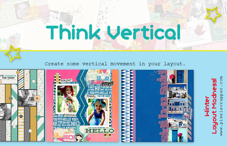
Create some vertical movement in your layout.


Remember to tag your layout with "wlm 2015" and to share your layout count towards your goal with us (ex: 3/14, if your goal was 14).
See here for details about Winter Layout Madness.

Create some vertical movement in your layout.
Remember to tag your layout with "wlm 2015" and to share your layout count towards your goal with us (ex: 3/14, if your goal was 14).
See here for details about Winter Layout Madness.
LONDON .....
Okay, I need some advice for this one! I scrap in landscape dimensions for a number of reasons, including that we use these images in our digital frame and because a few times a year I print them off in a book, so I prefer to have them all in the same orientation.
But scrapping landscape isn't very common - 99% of the layouts I see are square. And adding VERTICAL dimension to a landscape layout just makes me scratch my head! I'm stumped.
So, does anyone have a suggestion for me, or better yet, visual inspiration (it could be a layout or just a picture)? THANKS!
Alexa, you don't need to change the orientation of your layout. You can just use some vertical lines or elements on your page--for example, put photos in a line that goes from top to bottom on the page; use a cluster that runs up and down; put a photo on the bottom of the page, and draw some lines or put in some ribbons or other elements from it to the top of the page...
Here is my LO for this challenge:

I've tried similar things on my layouts, Julie, but somehow it doesn't give it the same feeling of height because the proportions are different. I do have a possible idea I'm toying around with at the moment, though. Thanks for sharing your layout!
FLY
love it Nan !
10/28 In my gallery HERE
#3/10
wlm 16/28 part of NaHeYa photo book 2014
I hope this qualifies for this challenge.
Here's mine!
6/?

5/14
Here's mine! Thanks for the template Marisa!
2/3
Here is mine, this challenge was tougher than I expected! 41/56.

Here is my layout for this challenge...

wlm 2015 vertical #13/14
ooo I knew exactly what photo I wanted to use for this one. wlm 21/28

wlm 2015 vertical 13/14
layout # 16/28
 https://www.digitalscrapbook.com/kamie-nanney/gallery/my-best-firend-s-wedding-layout-wlm-2015-blue
the picture is horrible but the only one i have
5/10

When I saw this challenge, I knew exactly which picture I wanted to use . . .
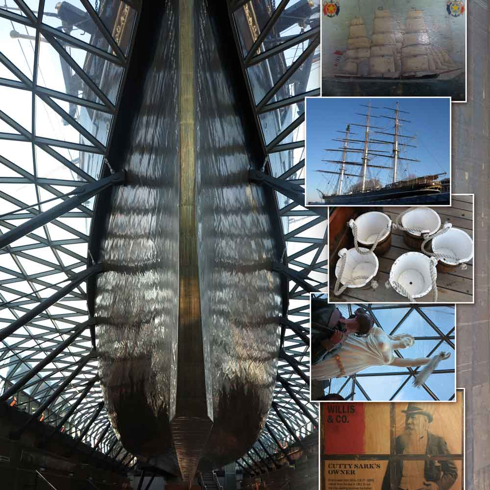
Top of the Rock (Right Side)

View in Gallery
I ended up making this as the right side of a two-page layout:

WLM2015 4/6
I love how some of us went vertical in overall design and others when vertical with a subject in a photo. These pages are great. Thanks for participating everyone.