
Please read the new guidelines before finishing your contribution.
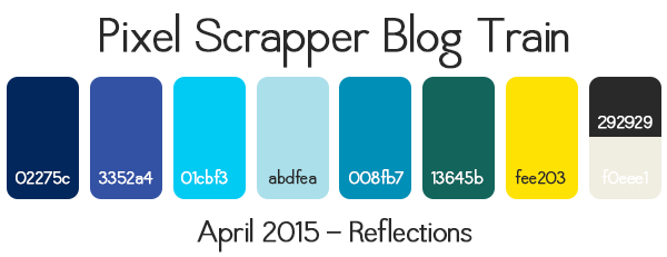
Something a little smaller and simpler this month!
Feel free to pin inspiration to our Pinterest board. If you'd like to be added to the board, please leave me a comment here (make sure you are following the board, or else I can't add you).
Yay! I couldn't wait to find out which colours we were going with! Yay! I'm not sure what I'm going to do but I'm going to do something!!
Not sure what I will do but going to give it a try.
Not sure if I can handle two trains back-to-back but, in case I can, what do you mean by "Reflections?" Not sure I understand the theme...
Yes, I am kinda curious where everyone is going with the 'reflections' theme as well.
I think the idea was anything, reflecting on things, water reflection, mirrors, it was a purposely vague theme from what I gathered... I might go off the path a bit, as none of these things inspire me but the palette sure does! I might make a couple pretty things and sit back and reflect on what a great job I did
I was thinking about a spring time themed kit that was 'Reflections of Winter'... That's what I'll do.. and name it. Yay! Now I don't feel so confused about how to use the theme. The blues work really well for winter theme elements, while the yellows are bright and happy for spring.
Reflections : Looking Back - that's what comes to my mind... I'll have to let this one simmer for a while! Or something to do with the sun reflecting off the water at the beach. Not sure about this one............
Hello!
I think all of you are right because the word "Reflections" can be considered like something related to water and also something related to the past, but I do not see these colors in an "old vintage-themed" kit, so your idea of remembering Winter is very good!
I have some other ideas, too: travelling/a trip, camping, a day at the park... what do you think?
I think I'm going to create a Christian theme of meditating (reflecting) on God's word. BTW, as I'm still trying to figure the blog trains out, I had a question about one of the papers I was creating. I was playing around with various filters, and created a page that I really like, but the filter seemed to throw another color into it (a darker yellow)and I wasn't sure if that was acceptable since we have a definite color scheme. Here is the example:
Will this work, or do I need to go try again?
Here's a site with 'reflection' quotes: http://www.brainyquote.com/quotes/keywords/reflection.html
Perhaps some of these may inspire you.
Thanks Rose, that will come in handy!
Kathryn, I like the overall look of the paper! When you blend overlays and stuff on colours it will change the actual colour from the palette. I think the main thing is to not change the hue, it's ok to change the saturation and brightness somewhat. The idea is that everything stays in the same colour scheme usually, but I'm not too sure how it works here and it's a good question. However most of the yellow on your page is out of gamut (maybe you hadn't gotten to the point of checking that yet!).
What I do when my colours go a bit strange (like when you add an overlay or use a filter) is that I either import the palette into my file (on top of the paper) or create a shape that I fill with the colour in question (yellow in your case) and then I look and see if my paper/element looks good together. If the colours clash a bit then I know I'm outside the palette. (then again I'm not an expert at how things are done here, I'm just telling you what I normally do).
You can find more about gamut and Quality Checking here: Practical Pointers for Blog Train Success - and don't worry, two months ago I had no idea what a gamut was or what it did, until someone who was doing a QC on my kit had to explain it a lot of kits in the BT had items/papers out of gamut, I'm not sure it matters too much if people are only using their creations online, but it could offer a problem in printing.
Thanks, France. I need to research more about the gamut. I still have so much to learn about graphic design! In the case of this paper, I used the exact colors (no other colors) that were in the palette, but when I used the filter, I think it created several gradients of the palette color, and I wasn't sure if that was accepted for the BTs. I also use Gimp instead of PS, so the way things are done within the program are different from most of what I have seen here, so that presents another challenge.
I'm so sorry Kathryn I don't know anything about Gimp! Yes, I learn something each time I try something! I spend a lot of time looking for stuff to use too! LOL!
I do like what the filter did though!!! Nice mosaic. Let's hope someone who knows better than me comes along and helps you out more than I have!
Frances Stewart: "I think the idea was anything, reflecting on things, water reflection, mirrors, it was a purposely vague theme from what I gathered... I might go off the path a bit, as none of these things inspire me but the palette sure does! I might make a couple pretty things and sit back and reflect on what a great job I did" smiley
HAHAHAHA, you crack me up. I might just borrow that idea myself
Much to my surprise, I'm actually doing something this time! (I'm surprised mainly because I wasn't too thrilled with the idea of 5 blues in a 9-colour palette! And, the green is a bit of a weird shade, too!) I'm basing my 'reflecting' on the memory of going to Rainbow Beach most weekends with my very first boyfriend in the 1970's - he was a volunteer surf lifesaver and while he was on patrol I would sit in his car (a bright orange Mini he called "The Brick") and do my homework, then when his shift finished, we would go to the beach together.
Anyway, I'm doing a paper bundle (probably with 4 kits) which is about half-done.
@Robyn, what a cute story!
@Kris so glad you get my sense of humour
I have now finished all the papers for my 4 kits! Three of them were really easy to get done, but the fourth was giving me no end of trouble. I just couldn't figure out how to get the effect I wanted. I eventually tried about four different ways of doing them until I had a sudden brainwave. And now they're done! Just have to do the previews, package them up, zip, and upload...
Update: Previews are now done!
I am liking this color theme. Not sure what I will come up with, but I better get busy.
I think I'm just about done with all the papers. Now, I just need to do the elements
I'm still stuck when it comes to the theme... When I look at the palette (love the colors) I think of water, sun & pine trees. But when I think of reflections, I think of landscapes reflecting their image in a body of water (lake, pond or what not). And I think that's artistic & all, but not really something you'd use for digiscrapping (except in the case where you're using your own personal photo, using the mirror image option on it & making that your background). Blah! As much as I thought of trying to make something for this train, I just don't know what to make! I've been doing searches online for hours & haven't found any inspiration... Is anyone else having this problem?
ATTN Lizanne: I think it's OK to design a kit based on your thoughts, afterall your thoughts are a form of reflection...see definition number seven here.
@Lizanne exactly what Rose said. I love the idea of your first idea (water, pine, sun). I'm not sure where I'm heading either but it'll all work out. ok, back to work now. coffee break over
I also agree with Rose...and it seems to be the direction I am headed. Reflecting on memories, thoughts for a loved one or well wishes. I will probably end up with more word art than actual elements this time.
After a long while of not doing kits, I will participate in this blog train! It seems very fun to me.
I would like to participate in this blog train -- my first with DigitalScrapbook.com!
i'm done
I don't know what happened, i started to make little bits you can Always use in a kit and suddenly i know what i was reflecting on.
Blue, and especcially these blue shades, remind me of my mother! It's her favorite color in the world and in my childhood i've lived with this color. I would get everything blue from her. Skirts, dresses, bows for my hair... Everything!! (And i'm more of a purple/green fan)
Anyhow, i added a few elements in there which "are" my mom. Like the crystal animal she collects (its not worlds greatest picture but i will never get that horse out of his showcase for a good picture while she's alive whihi) and the famous stone jar or "Keulse pot" she collects. Also the Boerenbond plate, typically her!! I'm sorry the plate has some red in it, it's not in the colorpalette but i just cannot change those Original colors.
@Soro that's so pretty!!! well done for being done
@Sally, welcome, can't wait to see what you come up with!!
Here's my preview

Hi, I would like to participate in this blog train. My first time, so I hope I'll manage!
I've never made anything for the blog trains before, but I think I will try this time. I love the color scheme and the open-ended topic.
Pages