
3. Since we're digital scrapbookers, I thought it would be fun to take a look at the different cover art available for this book. How do these different covers change your idea of the book? Which one do you like best? How do they set the mood and what expectations do they raise?
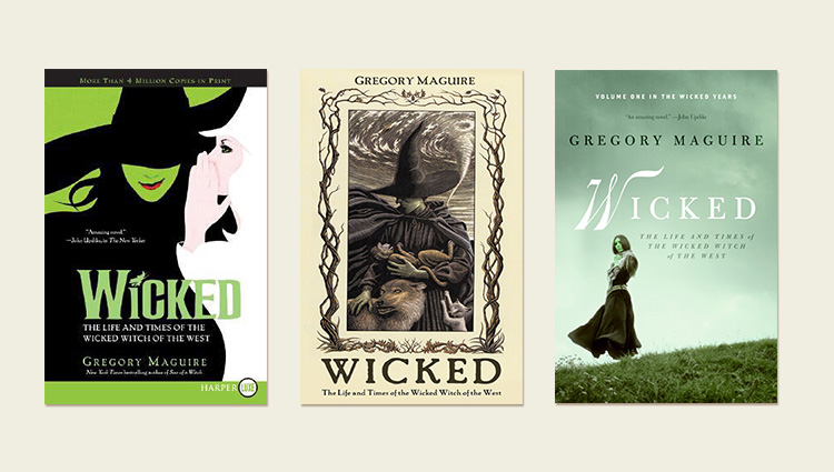
My copy is the second cover. I've never seen the third but I love it. I wish they hadn't used the Wicked musical art for a cover. It makes it seem too light hearted and this book really isn't.
I agree Brandi, regarding the musical cover. In my head the book and the show are two separate things.
My cover is different than all of these. It was the one that was listed on the voting page.
I do think the second one does the best at capturing the feel of the story.
Gosh they are very different aren't they? The first (the show one) seems aimed at a younger audience to me and it promises something light. The second looks intriguing and would be the one that attracted me - though it is still looking like a young adult book. The third I do not like at all - it looks full of teenage angst and melodrama.
The second makes me expect fantasy and mystery and it looks like it might be a darker tale - that's what I'm hoping for anyway
Sadly I only seem able to get the first cover. Shucks.
Honestly, probably the first cover is what would make me pick up the book first. Although, I'd probably pick up the other ones too, although I'd be a bit more nervous about what I was getting into. I do like in the third one all the empty space. The middle one seems the most cramped and stressful.
Oh, I agree with Brandi, too! Though the musical was great! I got the second cover on Kindle, but the third one was the preview cover online for the Kindle version (go figure)!
I think the second one is kind of creepy.
That reminds me...we had a "Wicked Witch" blog train a few years ago...
The second cover is the one we have at the Library and intrigues me enough to read it. I think if the first one were the only cover I would pass on it; just to frou frou for my taste. The third one reminds me of a historical suspense, Mary Stewart type novel.
I think the first cover is definitely made to draw in a younger group and it looks kind of "cheesy" for a book cover...therefor drawing in younger people.
The second cover kind of reminds me of something you'd see with Grimm's fairy tales. It looks like a "classic" book but also dark and slightly morbid, in my opinion.
And the third cover is very dreary...it reminds me of books you'd see in the YA section of libraries and bookstores.
Out of the three I'd probably lean towards the 2nd and 3rd book covers, the first one is just too cheesy for my taste. From what I've heard about the book, the 2nd and 3rd covers are the ones that fit well with the overall feel of the book.
I like the cover for the first and second one the best. I don't like the third one at all. I would not even pick that one up to have a look at it in the store. It looks like one of those creepy horror movies which I do not like at all.
The first one does seem to be lighter and not so "Wicked", and the second one does seem wicked and kind of scary looking but I would wonder what the story is about.
The musical made the book popular again though the musical is so loosely based on the book. The musical is the cleaned up family friendly version of the book. But most people know of the show rather than the novel. The book I bought has pictures from the show in the middle of it.
The "cover" for the audio version that I am downloading is different again and a bit cartoony in my opinion. The second (middle) image above would be the one that would have me click through to read more.
The second one is the one that I have. I like it because it portrays her as nurturing.
Dawn, you are right about the first cover having a lighter feel, I find that it did give me the preconception of the book being a lighter read than it is... However, the second may seem a bit too dark.
The third cover is beautiful and I feel as if it fits the story a bit better after I've been reading for a while...
Well, it is interesting to see how each cover can be judged