Created By
About Me
I̶ ̶c̶o̶l̶l̶e̶c̶t̶ ̶p̶e̶z̶ ̶d̶i̶s̶p̶e̶n̶s̶e̶r̶s̶ ̶a̶n̶d̶ ̶h̶a̶v̶e̶ ̶1̶5̶0̶0̶+̶
I love the mountains and being outside
I went to Africa for a whole day once
I have an awesome husband named Bill
I love to look at pictures, my own and everyone else's
I randomly open fridges - yep - everywhere I go - I don't even know why and most of the time I open it and close it and can't even tell you what was in there - maybe it is my subconscious making sure I will have food if I am stuck there for a few days - very strange - I don't get it
instgram: https://instagram.com/pezian1984/
Description
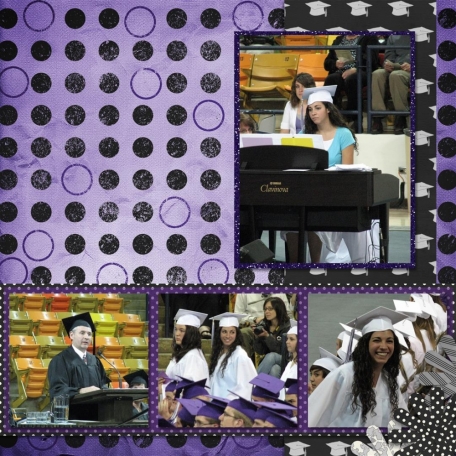
The second page of my sisters graduation.
I am hoping you guys can help me with what to put in that big blank spot.
I used Grad and Color Basics: Purple.
----
I submitted this layout for Layout Critique here at DigitalScrapbook.com. Here is the new version.
Stats
- Uploaded Tue, 06/04/2013 - 19:32
- 147 Views
- 10 Comments
- 2 People heart this


Recent Comments
Thanks Marie, I really disliked this page though so I redid the entire thing. I edited the description so that the link to the new 2 page spread is there.
Nice 2nd portion to a great layout.
You could just enlarge and spread out the title so half is on each page. The title you made looks like it could be separated in half pretty easily.
I liked the idea of putting lace or books into the space. You definitely should put something there. You could also consider journaling about the event in that space. I think the green and orange chairs are very distracting. Perhaps you could tint the colour to something less conflicting?
Loving all the suggestions so far. I will have to rework these pages next week sometime ^^
Kaleena, I like this double page. Your sister remembers me a roomie I had ;)
More than once I had the same problem of a "hole" in the middle of a double page that didn´t look good although both pages are pretty and well-balanced. The way I´d solve it, would be putting the top picture in the middle (or in the left?) of this page, and a cluster where the picture is now. But I´ll also look for other´s answers, in a way I can learn new solutions to the next time I face this kind of problem - so far, I think that Amber idea might work, and the other comments also gave me the idea that the black paper may, possibly, be shaped in a second mat for the top picture, in a way it stands more. In my opinion the mat for the bottom pictures and the glitter around the top one are awesome!
The strong background paper is what I think makes the pages difficult. The grad paper and dot paper get lost in the mix. Maybe switch them around? I would agree with Marisa, stretch the words across to make them associate on both pages. Then maybe tuck one of your corner flowers near the words on the right page. Perhaps sneak another color in, the pink from the sweater or light blue from the piano shot. The photos are great and I can see why you want to show them off with a big layout.
Since it's a double layout, I would probably stretch something across the gap, probably not all the way, from picture to picture, but almost all the way. The vertical papers in the background I might switch to being horizontal. Giving it more horizontal flow, rather than both as you have right now.
Perhaps repeat the cluster you have on bottom right of page onto top left to fill up the space.
I love all the polka dots...I saw you were looking for some help with this page...perhaps you could switch up the top and bottom of this page...it would still fit with the other but be the opposite.